Money is personal. When users hesitate before tapping “send” on a payment app, they aren’t just questioning the interface. They’re questioning whether the institution behind it can be trusted with their financial life. For FinTech companies, trust isn’t a brand value. It’s the product. Here’s how design builds the confidence that keeps users transacting. The […] The post FinTech Design: Building T
Money is personal. When users hesitate before tapping “send” on a payment app, they aren’t just questioning the interface. They’re questioning whether the institution behind it can be trusted with their financial life.
For FinTech companies, trust isn’t a brand value. It’s the product. Here’s how design builds the confidence that keeps users transacting.
The Trust Deficit: Why FinTech Is Different E-commerce users tolerate friction. Social media users expect it. Banking users?
They demand reassurance. A study found that 89% of consumers say trust is a primary factor in choosing a financial provider. When users feel uncertain about a transaction, they abandon it.
When they feel uncertain about the platform, they close the account. The stakes are higher for digital-native banks. Without physical branches, every pixel of the interface carries the weight of establishing credibility that traditional banks inherit from brick-and-mortar presence.
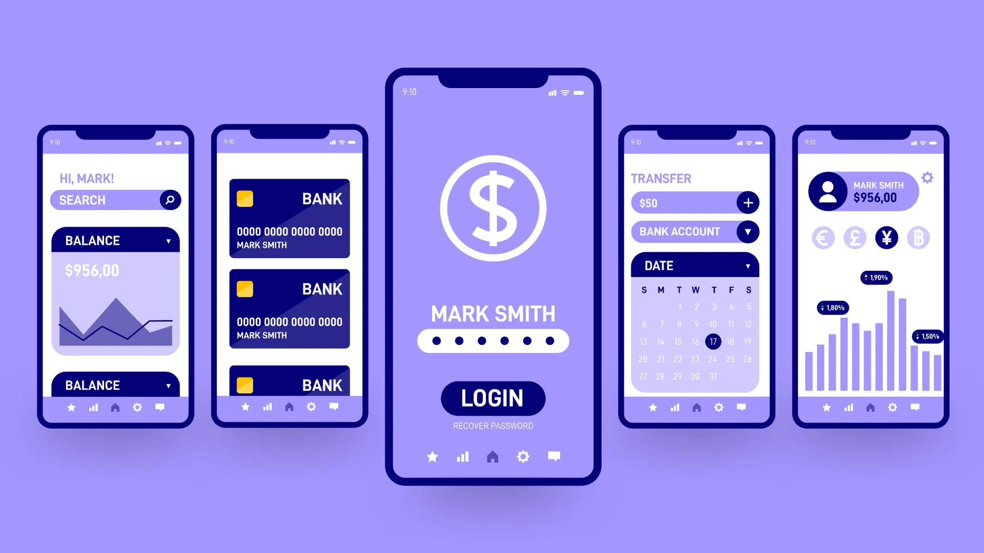
Security Cues: Signaling Safety Without Scaring Users Security must be visible without being alarming. The balance is delicate. Visual consistency is foundational.
A study by the Baymard Institute found that when users perceive visual inconsistency, mismatched colors, jarring typography, unclear layouts, they associate it with higher security risk, even if the site is technically secure. Inconsistency reads as amateur. Amateur reads as unsafe.
Proactive security communication works. Users feel more secure when they see messages like “Your session is encrypted” or “We never ask for your password by email.” But placement matters. In-page security badges generate significantly higher trust than isolated trust seals that users have learned to ignore.
Progress indicators matter in financial flows more than anywhere else. A payment confirmation that appears without visual progression feels suspicious. Step-by-step progress, “Verifying payment,” “Processing,” “Complete”, signals a system in control, not a black box.
Error Prevention: The Ultimate Trust Builder The best error message is the one users never see. In FinTech, preventing errors is the highest form of trust-building. Real-time validation catches mistakes before they become problems.
A bank account number field that checks format as users type, a routing number that auto-validates against the bank name, these micro-interventions save users from the panic of realizing they sent money to the wrong account. Confirmation screens for irreversible actions are non-negotiable. When users click “Send money” to a new recipient, a clear summary screen showing amount, recipient, and any fees isn’t friction.
It’s the moment users confirm they trust the information they’ve entered. The best implementations require users to type the amount or recipient name to confirm, a small action that dramatically reduces errors. Helpful error messages matter when prevention fails.
“Transaction declined” is useless. “Your card was declined because your billing address doesn’t match. Please verify the address on file with your bank” gives users a path forward.
Every error should answer: what happened, why, and what the user should do next. Designing for Generations: One Interface, Different Needs Financial products serve everyone from Gen Z to Boomers. The interface must accommodate different mental models without fragmenting the experience.
Gen Z (born 1997–2012): Digital natives who expect speed, mobile-first design, and transparency. They respond to minimalist interfaces with clear data visualization. They want to see their financial health at a glance, not dig through menus.
But they also need guardrails, the first generation with less cash experience needs education embedded in the flow. Millennials (born 1981–1996): The most digitally active banking segment. They value convenience and integration, peer-to-peer payments, budgeting tools, investment options all in one place.
They trust peer reviews and transparent fee structures. For this group, design errors signal broader institutional incompetence. Gen X (born 1965–1980): They remember banking before the internet.
They trust established institutions but demand digital convenience. This group values security explanations and clear customer support access. They’re more likely to pick up the phone when confused, so making phone support visible matters.
Boomers (born 1946–1964): They built their financial lives before digital. Trust in this group is built through clarity, not speed. Larger tap targets, higher contrast text, and straightforward language matter more than design innovation.
They need to feel the interface won’t trick them. The challenge is designing an interface that serves all four. The solution is progressive disclosure: simple views for straightforward tasks, deeper tools for those who want them, and consistent behavior that rewards familiarity over time.
What Breaks Trust (And How to Fix It) Hidden fees. A study found that unclear or hidden pricing is the fastest way to erode